
Data helps us make decisions, especially about traveling solo as a female. However, data is often presented in an indigestible format. Infographics, visual representations of information, make data more readable by helping us see patterns. In this blog post, I will analyze a few infographics on solo female travel, highlighting what they did well and what could be improved.
Each infographic presents complex information effectively through visual hierarchy, color choices, typography, a balance of text and visuals, and storytelling.
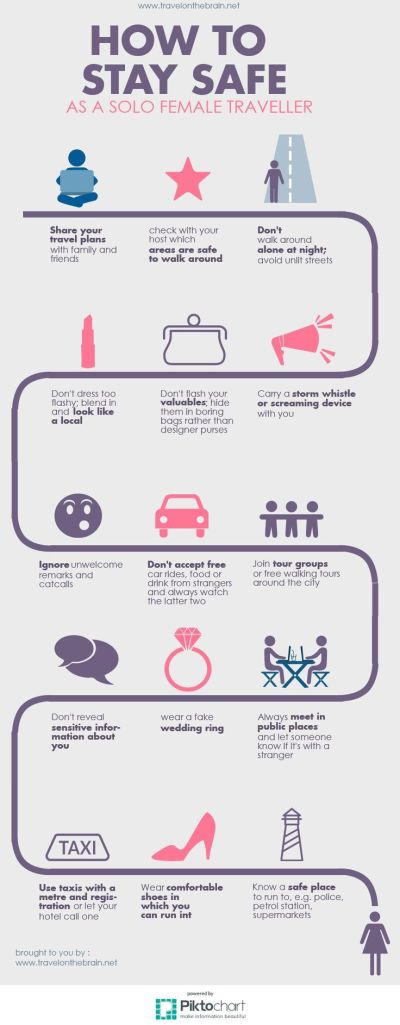

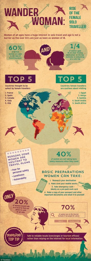
A key strength of these infographics is their visual hierarchy. The first infographic (safety tips) follows a sequential path, making it easy to follow each tip. Icons and bolded text highlight key points, ensuring clarity. The second infographic (solo traveler motivations) is well-organized, presenting statistics in a digestible format. Using a pie chart for shared room preferences and bar charts for travel styles by age group makes data easy to compare. The third infographic (Wander Woman) uses maps, percentages, and icons to convey safety concerns and travel trends. Structured sections clearly separate key data points. This method makes the infographic visually appealing and easy to navigate. If I were to create an infographic, I would use this approach to enhance visual hierarchy.
Color significantly impacts readability and engagement. The first infographic uses purples and pinks to create a calm and professional aesthetic, aligning with the theme of safety. The second infographic features bright, inviting colors like yellow and blue, evoking a sense of adventure and optimism. These colors align well with the theme of solo travel benefits. The third infographic uses an earthy, vintage-style palette, reinforcing the theme of travel history and female empowerment. All three contrast well with their backgrounds, making the information readable—something I would apply to my own infographic.
Typography also plays an important role. These infographics use typography effectively to enhance clarity. The first infographic highlights key safety tips with bolded words, ensuring quick comprehension. The second infographic maintains a simple, consistent font style that enhances readability without unnecessary complexity. The third infographic uses vintage-style fonts that fit the theme while remaining legible. The third infographic’s font is the most visually interesting while still being readable. Typography is crucial in an infographic as it enhances readability, directs attention, and reinforces the overall visual structure. Well-chosen typography ensures key information stands out, making data easier to understand.
A good infographic balances visuals and text. The first infographic uses icons to illustrate actions, such as a whistle representing a safety device, reducing text dependency. The second infographic blends illustrations and charts, keeping information engaging without overwhelming the reader. The third infographic incorporates maps, graphs, and pictograms to break down data, ensuring visual appeal while maintaining depth. This balance is crucial—too much text can overwhelm, while excessive visuals without explanation can be unclear. In my infographic, I would ensure both elements complement each other effectively.
Finally, a strong infographic tells a clear story with data. The first infographic presents a step-by-step safety guide for solo travelers. The second infographic explains why people choose solo travel, making it relatable. The third infographic blends statistics, travel trends, and concerns, offering a well-rounded perspective on female solo travel. An infographic should do more than present facts—it should create a narrative that helps the viewer understand the significance of the data.
These infographics effectively communicate travel-related information through thoughtful design. By incorporating strong visual hierarchy, strategic color use, readable typography, and a balance of visuals and text, they create engaging and informative content. I will apply these principles in my infographic to ensure clarity, engagement, and impact.
